JScrollPane
provides a scrollable view of a component. When screen real
estate is limited, use a scroll pane to display a component that is large or
one whose size can change dynamically.
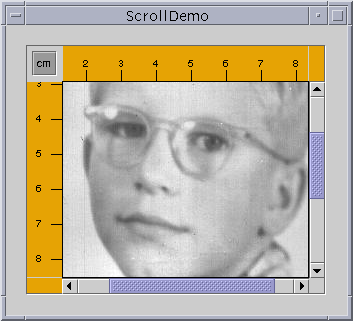
Here is a snapshot of an application that uses a customized scroll
pane to view a large photograph:
The scroll pane also has two scroll bars, a row header, a column header, and four corners, three of which have been customized.
This program establishes the scroll pane's client when creating the scroll pane:
// where the member variables are declared
private ScrollablePicture picture;
...
        // where the GUI is created
        picture = new ScrollablePicture( ... );
        JScrollPane pictureScrollPane = new JScrollPane(picture);
You can change a scroll pane's client dynamically by
calling the setViewportView method. Note that
JScrollPane has no corresponding getViewportView
method, so you should cache the client object in a variable if you need to
refer to it later.
When the user manipulates the scroll bars in a scroll pane, the area of the client that is visible changes accordingly. This picture shows the relationship between the scroll pane and its client and indicates the classes that the scroll pane commissions to help:

JViewport
instance to manage the visible area of the client. The viewport
is responsible for computing the bounds of the current visible area, based on
the positions of the scroll bars, and displaying it.
A scroll pane uses two separate instances of JScrollBar
for the scroll bars. The scroll bars provide the interface for
the user to manipulate the visible area. The following figure shows the three
areas of a scroll bar: the knob, the buttons, and the track.
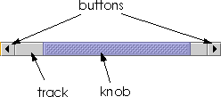
By clicking a button, the user can scroll by a unit increment. By clicking within the track, the user can scroll by a block increment. Information about unit and block increments is in Implementing a Scrolling-Savvy Client.
Typical programs don't directly instantiate or call methods on a viewport
or scroll bar. Instead, programs achieve their scrolling behavior using the
JScrollPane API and the API discussed in Implementing
a Scrolling-Savvy Client. Some scrolling-savvy components such as
JList, JTable, and JTree also provide
additional API to help you affect their scrolling behavior.
On startup, the scroll pane in the ScrollDemo
application has two scroll bars. If you make the window as large as your
screen, both scroll bars disappear because they are no longer needed. If you
then shrink the height of the window without changing its width, the vertical
scroll bar reappears. Further experimentation will show that in this
application both scroll bars disappear and reappear as needed. This behavior
is controlled by the scroll pane's scroll bar policy, Actually, it's
two policies: you specify the policy for each scroll bar separately.
ScrollDemo doesn't explicitly set the scroll pane's sroll bar
policies--it uses the default. But you can set the policies when you create
the scroll pane or change them dynamically.
Of the constructors provided by JScrollPane, these two let you
set the scroll bar policies when you create the scroll pane:
The firstJScrollPane(Component, int, int) JScrollPane(int, int)
int specifies the policy for the
vertical scroll bar, the second specifies the policy for the horizontal scroll
bar. You can also set the policies dynamically with the
setHorizontalScrollBarPolicy and
setVerticalScrollBarPolicy methods. With both the constructors
and the methods, use one of the following constants defined in the ScrollPaneConstants
interface (which is implemented by JScrollPane):
| Policy | Description |
|---|---|
VERTICAL_SCROLLBAR_AS_NEEDED HORIZONTAL_SCROLLBAR_AS_NEEDED |
The default. The scroll bar appears when the viewport is smaller than the client and disappears when the viewport is larger than the client. |
VERTICAL_SCROLLBAR_ALWAYS HORIZONTAL_SCROLLBAR_ALWAYS |
Always display the scroll bar. The knob disappears if the viewport is large enough to show the whole client. |
VERTICAL_SCROLLBAR_NEVER HORIZONTAL_SCROLLBAR_NEVER |
Never display the scroll bar. Use this option if you don't want the user to directly control what part of the client is shown. Perhaps you have an application that requires all scrolling to occur programmatically. |
The area drawn by a scroll pane consists of up to nine parts: the center, four sides, and four corners. The center is the only component that is always present in all scroll panes. Besides scroll bars, the sides can contain column and row headers. A corner component is visible only if both sides that intersect at that corner contain visible components.
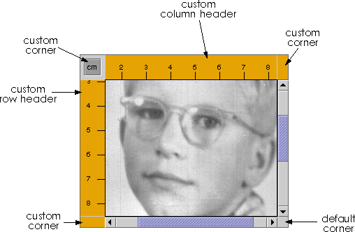
As shown in the figure, the scroll pane in ScrollDemo has
custom row and column headers. Additionally, because all four sides are
populated, all four corners are present. The program customizes three of the
corners--two just fill their area with the same color as the
Rules, and the other contains a toggle button. The fourth corner,
the lower right corner, is the default provided by the scroll pane. Notice
that because the row and column headers are always present in this example,
that the toggle button is also always present.
If a corner contains a control that the user needs access to all the time, make sure the sides that intersect at the corner are always present. For example, if this application placed the toggle in the lower right corner where the scroll bars intersect, then the toggle would disappear if the user resized the window and even one of the scroll bars disappeared.
The scroll pane's row and column headers are provided by a custom
JComponent subclass, Rule, that draws a
ruler in centimeters or inches. Here's the code that creates and sets the
scroll pane's row and column headers:
//...where the member variables are defined:
private Rule columnView;
private Rule rowView;
...
    //...where the GUI is initialized:
    ImageIcon david = new ImageIcon("images/youngdad.jpeg");
    ...
    // Create the row and column headers
    columnView = new Rule(Rule.HORIZONTAL, true);
    columnView.setPreferredWidth(david.getIconWidth());
    rowView = new Rule(Rule.VERTICAL, true);
    rowView.setPreferredHeight(david.getIconHeight());
    ...
    pictureScrollPane.setColumnHeaderView(columnView);
    pictureScrollPane.setRowHeaderView(rowView);
    ...
JViewPorts of their own. Thus, when scrolling horizontally, the
column header follows along, and when scrolling vertically, the row header
follows along.
As a JComponent subclass, our custom Rule class
puts its rendering code in its paintComponent method. Careful
scrutiny of the code reveals that special effort is taken to draw only within
the current clipping bounds. Your custom row and column headers should do the
same to ensure speedy scrolling.
You can also use any component for the corners of a scroll pane.
ScrollDemo illustrates this by putting a toggle button in the
upper left corner, and custom Corner objects in
the upper right and lower left corners. Here's the code that creates the
Corner objects and calls setCorner to place them:
// Create the corners.
JPanel buttonCorner = new JPanel();
isMetric = new JToggleButton("cm", true);
isMetric.setFont(new Font("SansSerif", Font.PLAIN, 11));
isMetric.setMargin(new Insets(2,2,2,2));
isMetric.addItemListener(new UnitsListener());
buttonCorner.add(isMetric); //Use the default FlowLayout
...
// Set the corners.
pictureScrollPane.setCorner(JScrollPane.UPPER_LEFT_CORNER,
                            buttonCorner);
pictureScrollPane.setCorner(JScrollPane.LOWER_LEFT_CORNER,
                            new Corner());
pictureScrollPane.setCorner(JScrollPane.UPPER_RIGHT_CORNER,
                            new Corner());
Corner class because that class colors its entire bounds,
whatever they happen to be, with a solid color.
As you can see from the code, constants indicate the corner positions. This figure shows the constant for each position:
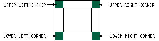
ScrollPaneConstants interface, which JScrollPane implements.
To customize the way that a client component interacts with its
scroll pane, you can make the component implement the Scrollable interface.
By implementing Scrollable, a client can
specify both the size of the viewport used to view it and the amount to scroll
for clicks on the different controls on a scroll bar.
Here again are the three control areas of a scroll bar: the knob, the buttons, and the track.
ScrollDemo that clicking the buttons scrolls the image to a tick
boundary. You might also have noticed that clicking in the track scrolls the
picture by a "screenful". More generally, the button scrolls the visible area
by a unit increment and the track scrolls the visible area by a
block increment. The behavior you see in the example is not the
scroll pane's default behavior, but is specified by the client in its
implementation of the Scrollable interface.
The client for the ScrollDemo program is ScrollablePicture.
ScrollablePicture is a subclass of JLabel that
provides implementations of all five Scrollable methods:
getScrollableBlockIncrement
getScrollableUnitIncrement
getPreferredScrollableViewportSize
getScrollableTracksViewportHeight
getScrollableTracksViewportWidth
ScrollablePicture implements the
Scrollable interface primarily to affect the unit and block
increments. However, it must provide implementations for all five methods. So
it provides reasonable defaults for the other three methods that you might
want to copy for your scrolling-savvy classes.
The scroll pane calls the client's getScrollableUnitIncrement
method whenever the user clicks one of the buttons on the scroll bar. This
method returns the number of pixels to scroll. An obvious implementation of
this method returns the number of pixels between tick marks on the header
rulers. But ScrollablePicture does something different: It
returns the value required to position the image on a tick mark boundary.
Here's the implementation:
public int getScrollableUnitIncrement(Rectangle visibleRect,
                                      int orientation,
                                      int direction) {
    //get the current position
    int currentPosition = 0;
    if (orientation == SwingConstants.HORIZONTAL)
        currentPosition = visibleRect.x;
    else
        currentPosition = visibleRect.y;

    //return the number of pixels between currentPosition
    //and the nearest tick mark in the indicated direction
    if (direction < 0) {
        int newPosition = currentPosition -
                         (currentPosition / maxUnitIncrement) *
                          maxUnitIncrement;
        return (newPosition == 0) ? maxUnitIncrement : newPosition;
    } else {
        return ((currentPosition / maxUnitIncrement) + 1) *
                 maxUnitIncrement - currentPosition;
    }
}
If the image is already on a tick mark boundary, this
method returns the number of pixels between ticks. Otherwise, it returns the
number of pixels from the current location to the nearest tick.
Likewise, the scroll pane calls the client's
getScrollableBlockIncrement method each time the user clicks on
the track. Here's ScrollablePicture's implementation of this
method:
public int getScrollableBlockIncrement(Rectangle visibleRect,
                                       int orientation,
                                       int direction) {
    if (orientation == SwingConstants.HORIZONTAL)
        return visibleRect.width - maxUnitIncrement;
    else
        return visibleRect.height - maxUnitIncrement;
}
Unless you explicitly set a scroll pane's preferred size, the scroll pane computes it based on the preferred size of its nine components (the viewport, and, if present, the two scroll bars, the row and column headers, and the four corners). The largest factor, and the one most programmers care about, is the size of the viewport used to display the client.
If the client is not scrolling-savvy, then the scroll pane sizes itself so that the client displays at its preferred size. For typical unsavvy clients, this makes the scroll pane redundant. That is, the scroll pane has no scroll bars because the client's preferred size is big enough to display the entire client. In this case, if the client doesn't change size dynamically, you should probably limit the size of the scroll pane by setting its preferred size or the preferred size of its container.
If the client is scrolling-savvy, then the scroll pane uses the value
returned by the client's getPreferredScrollableViewportSize
method to compute the size of its viewport. Implementations of this method
generally report a preferred size for scrolling that's smaller than the
component's standard preferred size. For example, by default, the value
returned by JList's implementation of
getPreferredScrollableViewportSize is just big enough to display
eight rows.
import java.awt.*;
import java.awt.event.*;
import javax.swing.*;
import javax.swing.border.*;

public class ScrollDemo extends JPanel {
    private Rule columnView;
    private Rule rowView;
    private JToggleButton isMetric;
    private ScrollablePicture picture;

    public ScrollDemo() {
        // Start loading the image icon now.
        ImageIcon david = new ImageIcon("youngdad.jpeg");

        // Create the row and column headers.
        columnView = new Rule(Rule.HORIZONTAL, true);
        columnView.setPreferredWidth(david.getIconWidth());
        rowView = new Rule(Rule.VERTICAL, true);
        rowView.setPreferredHeight(david.getIconHeight());

        // Create the corners.
        JPanel buttonCorner = new JPanel();
        isMetric = new JToggleButton("cm", true);
        isMetric.setFont(new Font("SansSerif", Font.PLAIN, 11));
        isMetric.setMargin(new Insets(2,2,2,2));
        isMetric.addItemListener(new UnitsListener());
        buttonCorner.add(isMetric); //Use the default FlowLayout

        // Set up the scroll pane.
        picture = new ScrollablePicture(david, columnView.getIncrement());
        JScrollPane pictureScrollPane = new JScrollPane(picture);
        pictureScrollPane.setPreferredSize(new Dimension(300, 250));
        pictureScrollPane.setViewportBorder(
                BorderFactory.createLineBorder(Color.black));

        pictureScrollPane.setColumnHeaderView(columnView);
        pictureScrollPane.setRowHeaderView(rowView);

        pictureScrollPane.setCorner(JScrollPane.UPPER_LEFT_CORNER,
                                    buttonCorner);
        pictureScrollPane.setCorner(JScrollPane.LOWER_LEFT_CORNER,
                                    new Corner());
        pictureScrollPane.setCorner(JScrollPane.UPPER_RIGHT_CORNER,
                                    new Corner());

        // Put it in this panel.
        setLayout(new BoxLayout(this, BoxLayout.X_AXIS));
        add(pictureScrollPane);
        setBorder(BorderFactory.createEmptyBorder(20,20,20,20));
    }

    class UnitsListener implements ItemListener {
        public void itemStateChanged(ItemEvent e) {
            if (e.getStateChange() == ItemEvent.SELECTED) {
                // Turn it to metric.
                rowView.setIsMetric(true);
                columnView.setIsMetric(true);
            } else {
                // Turn it to inches.
                rowView.setIsMetric(false);
                columnView.setIsMetric(false);
            }
            picture.setMaxUnitIncrement(rowView.getIncrement());
        }
    }

    public static void main(String s[]) {
        JFrame frame = new JFrame("ScrollDemo");
        frame.addWindowListener(new WindowAdapter() {
            public void windowClosing(WindowEvent e) {
                System.exit(0);
            }
        });

        frame.setContentPane(new ScrollDemo());
        frame.pack();
        frame.setVisible(true);
    }
}
import java.awt.*;
import java.awt.event.*;
import javax.swing.*;
import javax.swing.border.*;

public class ScrollablePicture extends JLabel implements Scrollable {

    private int maxUnitIncrement = 1;

    public ScrollablePicture(ImageIcon i, int m) {
        super(i);
        maxUnitIncrement = m;
    }

    public Dimension getPreferredScrollableViewportSize() {
        return getPreferredSize();
    }

    public int getScrollableUnitIncrement(Rectangle visibleRect,
                                          int orientation,
                                          int direction) {
        //Get the current position.
        int currentPosition = 0;
        if (orientation == SwingConstants.HORIZONTAL)
            currentPosition = visibleRect.x;
        else
            currentPosition = visibleRect.y;

        //Return the number of pixels between currentPosition
        //and the nearest tick mark in the indicated direction.
        if (direction < 0) {
            int newPosition = currentPosition -
                             (currentPosition / maxUnitIncrement) *
                              maxUnitIncrement;
            return (newPosition == 0) ? maxUnitIncrement : newPosition;
        } else {
            return ((currentPosition / maxUnitIncrement) + 1) *
                   maxUnitIncrement - currentPosition;
        }
    }

    public int getScrollableBlockIncrement(Rectangle visibleRect,
                                           int orientation,
                                           int direction) {
        if (orientation == SwingConstants.HORIZONTAL)
            return visibleRect.width - maxUnitIncrement;
        else
            return visibleRect.height - maxUnitIncrement;
    }

    public boolean getScrollableTracksViewportWidth() {
        return false;
    }

    public boolean getScrollableTracksViewportHeight() {
        return false;
    }

    public void setMaxUnitIncrement(int pixels) {
        maxUnitIncrement = pixels;
    }
}
import java.awt.*;
import javax.swing.*;

public class Corner extends JComponent {
    public void paintComponent(Graphics g) {
        // Fill me with dirty brown/orange.
        g.setColor(new Color(230, 163, 4));
        g.fillRect(0, 0, getWidth(), getHeight());
    }
}
import java.awt.*;
import javax.swing.*;

public class Rule extends JComponent {
    public static final int INCH = Toolkit.getDefaultToolkit().
            getScreenResolution();
    public static final int HORIZONTAL = 0;
    public static final int VERTICAL = 1;
    public static final int SIZE = 35;

    public int orientation;
    public boolean isMetric;
    private int increment;
    private int units;

    public Rule(int o, boolean m) {
        orientation = o;
        isMetric = m;
        setIncrementAndUnits();
    }

    public void setIsMetric(boolean isMetric) {
        this.isMetric = isMetric;
        setIncrementAndUnits();
        repaint();
    }

    private void setIncrementAndUnits() {
        if (isMetric) {
            units = (int)((double)INCH / (double)2.54); // dots per centimeter
            increment = units;
        } else {
            units = INCH;
            increment = units / 2;
        }
    }

    public boolean isMetric() {
        return this.isMetric;
    }

    public int getIncrement() {
        return increment;
    }

    public void setPreferredHeight(int ph) {
        setPreferredSize(new Dimension(SIZE, ph));
    }

    public void setPreferredWidth(int pw) {
        setPreferredSize(new Dimension(pw, SIZE));
    }

    public void paintComponent(Graphics g) {
        Rectangle drawHere = g.getClipBounds();

        // Fill clipping area with dirty brown/orange.
        g.setColor(new Color(230, 163, 4));
        g.fillRect(drawHere.x, drawHere.y, drawHere.width, drawHere.height);

        // Do the ruler labels in a small font that's black.
        g.setFont(new Font("SansSerif", Font.PLAIN, 10));
        g.setColor(Color.black);

        // Some vars we need.
        int end = 0;
        int start = 0;
        int tickLength = 0;
        String text = null;

        // Use clipping bounds to calculate first tick and last tick location.
        if (orientation == HORIZONTAL) {
            start = (drawHere.x / increment) * increment;
            end = (((drawHere.x + drawHere.width) / increment) + 1)
                  * increment;
        } else {
            start = (drawHere.y / increment) * increment;
            end = (((drawHere.y + drawHere.height) / increment) + 1)
                  * increment;
        }

        // Make a special case of 0 to display the number
        // within the rule and draw a units label.
        if (start == 0) {
            text = Integer.toString(0) + (isMetric ? " cm" : " in");
            tickLength = 10;
            if (orientation == HORIZONTAL) {
                g.drawLine(0, SIZE-1, 0, SIZE-tickLength-1);
                g.drawString(text, 2, 21);
            } else {
                g.drawLine(SIZE-1, 0, SIZE-tickLength-1, 0);
                g.drawString(text, 9, 10);
            }
            text = null;
            start = increment;
        }

        // ticks and labels
        for (int i = start; i < end; i += increment) {
            if (i % units == 0)  {
                tickLength = 10;
                text = Integer.toString(i/units);
            } else {
                tickLength = 7;
                text = null;
            }

            if (tickLength != 0) {
                if (orientation == HORIZONTAL) {
                    g.drawLine(i, SIZE-1, i, SIZE-tickLength-1);
                    if (text != null)
                        g.drawString(text, i-3, 21);
                } else {
                    g.drawLine(SIZE-1, i, SIZE-tickLength-1, i);
                    if (text != null)
                        g.drawString(text, 9, i+3);
                }
            }
        }
    }
}
Maintained by John Loomis, last updated 15 June 2000